
Based on my experience with Season, I had some sense of what to expect regarding workflow and how things would more or less proceed during the production process of my second book, The Flavor Equation. Still, I was swimming in unchartered territories when it came to the illustration process. It’s easier for me to work on photography, styling, and writing, but illustrations aren’t my skill (no matter how hard I try).
The Flavor Equation is a science-based cookbook, and some ideas and examples are easier illustrated than conveyed through long sentences. Sometimes a photograph might not be the best option. Illustrations made science fun for me in school and provided an easier way to conceptualize science more tangibly. Hence, early on, when I sold my book proposal to my publisher, Chronicle Books, I brought up the need for an illustrator. While working through my manuscript, I turned in several hand-drawn sketches that I drew out on my iPad (Notes and The Concepts App were lifesavers) that I shared with my book designer, Lizzie Vaughn, and my editor, Sarah Billingsley. They then looked through several portfolios of illustrators who had experience with science artwork but also for people who could make science through their art approachable, and fun, and also tie in with my style of photography and design. Among the portfolios, I looked at, one artist’s work immediately stood out, and I connected with it immediately – Matteo Riva. Together we made a list of illustrations and worked through them together, finessing them with every iteration, and how we managed to get all of this done as the COVID pandemic started to kick off everywhere.
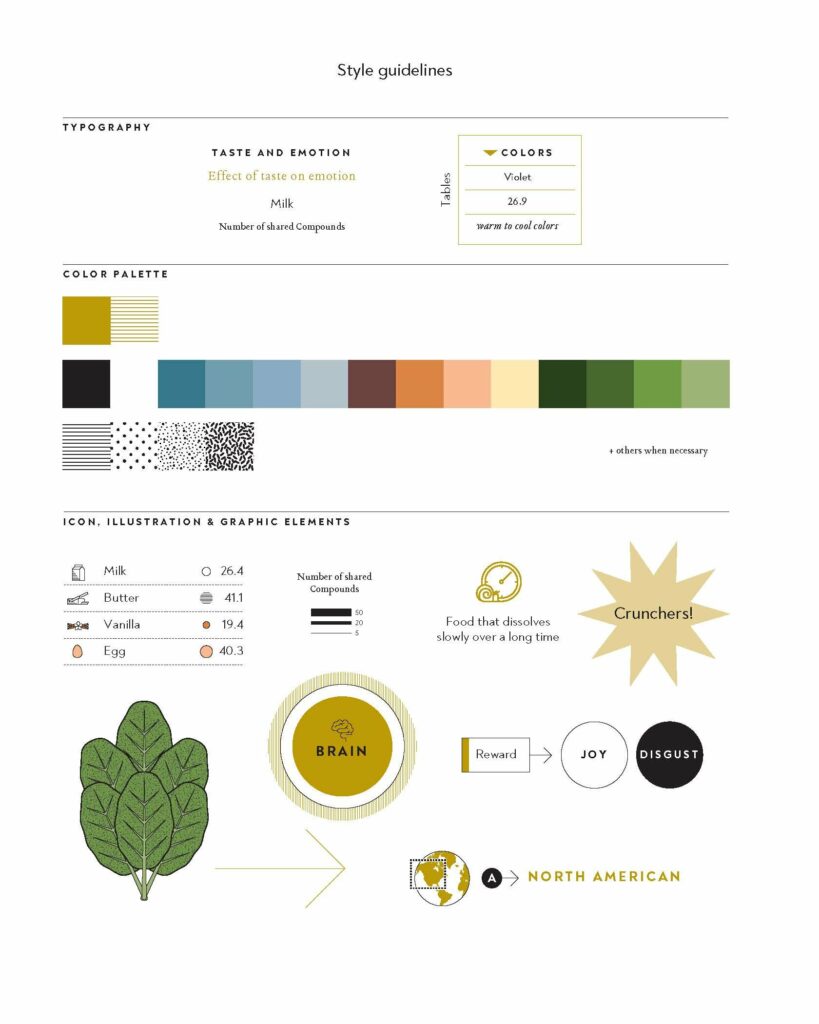
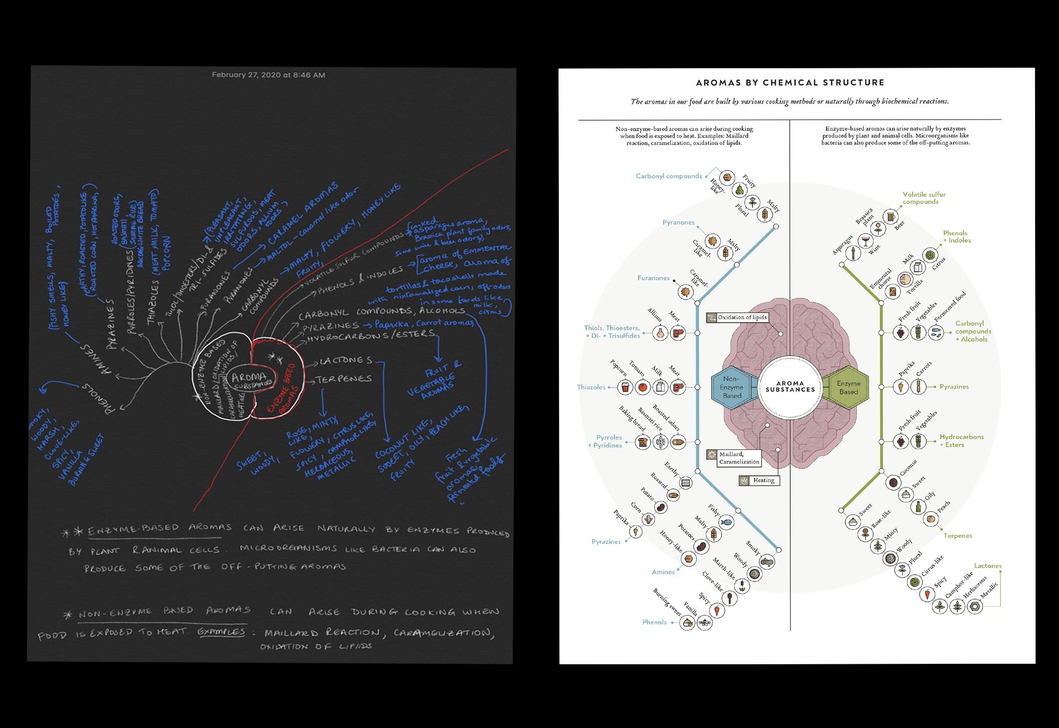
Lizzie worked out fonts, design concepts, etc., with Matteo, and one of the first things I received was the image you see on top with the design/artwork scheme for The Flavor Equation. They made my sketches and tables (somewhat crazy and all-over-the-place style) beautiful, and I am so happy with how they turned out. I will get a couple of them printed to hand in my kitchen and office.
You now know about my thoughts on illustrations, but what about Lizzie and Matteo, I decided to ask them a few questions, and this is what they had to say.
First up, my wonderfully talented book illustrator, Matteo Riva.
What is the process of choosing an illustrator like?
I generally start from some references/precedents where I can find inspiration. In the past, I collected several infographics books, which are still very precious, especially when you start a new project. Second step: I sketch some proposals on paper, keeping in mind the artwork’s general structure. Third step: finally, I start making drawing with Adobe Illustrator. At the early stage, I try to fit the page with all the contents required (i.e., text, charts). Then I move the elements inside the page space to find the best way to communicate the information. Meanwhile, in my mind, I try to visualize one or more illustrated elements associated with the contents. It could be an icon, a big illustration, or typographical elements. The purpose is to design a well-balanced artwork that exposes texts and information using illustrated language.
How did you tailor the art scheme/brand guidelines—colors and styles—to fit the book’s science and food themes?
In simple words, I can answer by giving you my definition of an infographic. It’s a combination of graphics, typography, and illustration to enable an interpretation of specific information. So my job for this book was to convert Nik’s sketches into something more illustrated, clear, and ruled by general style guidelines that matched the book’s visual. Working with a great art director like Lizzie Vaughan, this phase was very helpful. She made me feel free to propose my ideas, leading a complex project clearly and safely.
It was also interesting thinking of these infographics as something where Nik’s double soul meets together (science and cooking). In design, that means building infographics as a mix of charts (the scientific side) and illustrated elements (the cook’s side), the perfect visual synthesis that figures Nik’s work.
Can you share a little about your history and experience, how you became so proficient in creating infographics, and what inspires you?
I can remember, during my childhood, being fascinated by big Atlas and Traveling guides. My father used to collect many of them since he was a member of the Touring Club, the most important Italian national tourist organization. Probably this unconsciously became a part of my early influences.
I graduated in Communication Design at Politecnico of Milano, where infographic design is key. I often designed infographics after graduation, but my principal job for several years was as the art director of a little Italian magazine called Vita This experience was very useful for understanding the relationship between designer and art director. In the last three years, I finally decided to dedicate my job almost entirely to infographics.
The most important experience for me was the one I gained with the La Repubblica creative team (the major Rome-based Italian Newspaper). In this newspaper, the infographic design is accurate, and open to creative solutions, and I step up as a professional.
Last, if I have to give you some names for big inspiration, my choice is Otto Neurath and his wife, Marie Reidemeister. Their work inspired me, due to their clarity and modernist look. I love the icons system design for Neurath by Gerd Arntz, with its minimal approach. As you can see, I prefer infographics where the illustrated aspect is dominant: the human brain is certainly facilitated to keep the meaning of specific content in mind.
And here’s what Lizzie, my book designer had to say.
We really lucked out! In brilliant serendipity, Matteo reached out to share his portfolio just as we were digging into the infographics for The Flavor Equation. The process of choosing an illustrator can entail hours of research, creating mood boards, and playing with visual samples in situ. In the early stages of The Flavor Equation, Nik pulled examples of illustrations he liked from other books and sources; we did preliminary book design layouts and narrowed in on a clear aesthetic direction. But we hadn’t committed to an artist. Matteo’s portfolio came in, and we quickly agreed—his adept ability and enthusiasm for visualizing complex information with fun and friendly colors and textures—perfect! That is exactly what we were searching for. From the get-go, we wanted the art for The Flavor Equationto be approachable and useful, but also evocative of scientific charts and simply . . .BEAUTIFUL. Matteo nailed it and was so great to work with.
I am so proud of this book, how it came together, and the entire team at Chronicle Books, Matteo, and my agent, Maria Ribas, who helped bring this book to life.
You can find Matteo Rivas on Instagram and check out his portfolio to see more of his work. Check out Lizzie Vaughn’s portfolio and see what she’s up to on Instagram.
To learn more about The Flavor Equation (October 2020) and how to preorder, click here.